Code
The source code is nothing spectacular. There is a high use of class names to help with specifity. The home page demos most of what the site has to offer and takes bits of information from all sections. It maintains a high level of specifity to make sure each part of the site is labeled as well as it can be, helping navigate code and making further adjustments easier.
User Interface - UI
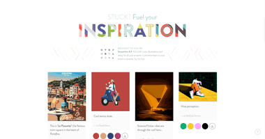
The UI seems very spacious and empty. But the site does it well; there's tons of space but that can help excite one's imagination which is the goal of the site. That being said, they attempt to cram as much info into small spots as they can, making sure to show off a fair amount of their offerings to fill the center of the user's screen.
User Experience - UX
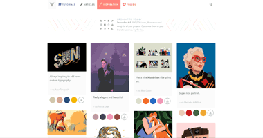
Just as described above, the use of empty space on this website meant to provide ideas helps fuel the client's imagination. "What could I use to fill the white space with?" is something that might go through the head of the user browsing this page. Having tons of possibly beneficial little graphics to provide inspiration to the user squashed at the center of the user's screen gives the user a playground of options to take and implement on their own projects.
Summary
Overall, this website does a fairly good job at providing the user with easy-to-access options for design ideas and the like. The website itself is very simple to navigate, with a simple nav bar up top along with a search function, and pages that have reasonable amount of content in a small, easy to read space. It's not a complex site, but it gets its point across effectively. I'd rate it an 8/10.