01 Extract UI
Active and Hover Link
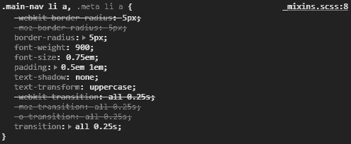
User Interface Discussion
I like this UI item because it gives a sense of interaction to the user when hovering their cursor over various links, while also highlighting the currently active page link.
The techniques used to make this UI aren't too complex. With the active link, it's given box shadows and a different color to make it pop out, while the hover link is given box shadows and a slightly different shade to make it look like the button is being pressed. There's also a transition from the regular position to the pressed look that makes it look more realistic and smooth.
Peaking Banner
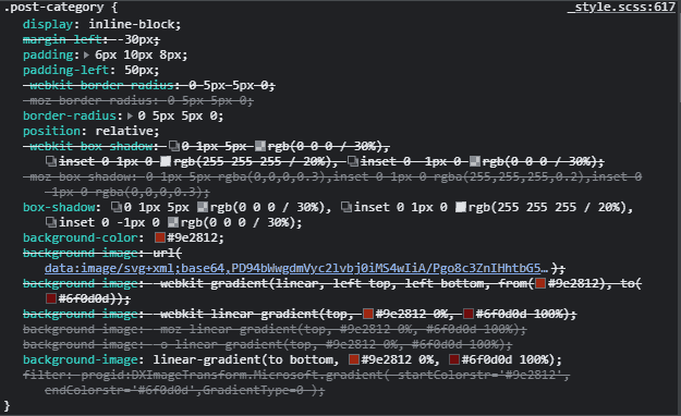
User Interface Discussion
This UI item looks pretty cool. While it doesn't serve much purpose in terms of usability, it gives the page a nice touch to have an item 'peaking' around the corner.
The item uses quite a few techniques. First, the little piece that appears to be folding around the corner is arranged to appear behind the 'banner' part. It is separate from the part that 'folds' around over the background. The 'banner' part itself is a rectangle with the borders smoothed out on the right side, and the rectangle has its margin shifted to the left to make it appear to be folding around from behind.
Aside Column
User Interface Discussion
I like this item because it keeps the page organized and gives the user a place to quickly access current or previous versions of JekyllRB, as well as access to other news.
This item was quite simple to create, simply create the text and graphics to go along with the plan, and have it float to the left with specific margins and width to fit properly and appear to be connected to the main body.
Active and Hover Link
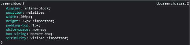
User Interface Discussion
I like this item because it gives the user a place to search for certain keywords, saving some time of looking manually.
Another simple item to create. A different color rectangle with smooth borders, a defined size, a magnafine glass graphic, and an area to input text.